
GalleryGo

Discover Plan Visit the best exhibition
The product:
An app & website help people discover, plan, visits exhibitions
Project duration:
July 2024 - Feb 2025
The problem:
Exhibition information are scatted around internet, every gallery have their own opening and closing time.
The goal:
A platform to gather all the information, making it easy to discover new exhibition & gallery
“I’ve always been aware of this issue since my art school days. Discovering new galleries and exhibitions often relies more on word-of-mouth. Sometimes, you only learn about something after it’s already closed.”
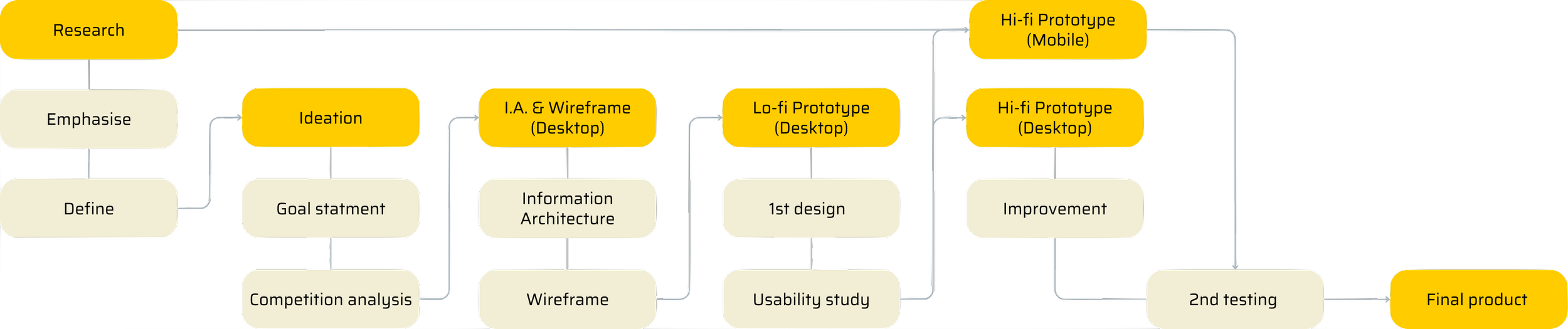
Process
User research
Based on research and conversations with industry insiders, I have discovered that the majority of individuals rely on either art-specific websites or social media platforms, or newsletters from galleries, for information pertaining to the art world.
Pain point 1
The selection of exhibitions featured on art-websites are heavily depends on the writer’s preferences and priorities. New galleries or smaller exhibitions may not receive the same level of attention or visibility.
Pain point 2
Gallery Newsletter is specific to the gallery and may vary depending on the director’s selection of exhibitions to curate.
Pain point 3
It can be challenging to locate suitable exhibitions for newcomers to the city.
Persona
Emma
Age: 23
Education: Undergrad student
Hometown: Brighton
Family: Live with her family
Occupation: Student
Goals
Become a full-time painting artist.
Finding inspiration, and building a network.
Frustrations
Missing an exhibition due to knowing too late.
Lack of industry connections.
Duncan
Age: 38
Education: Master / doing his PHD
Hometown: London
Family: Live with his partner
Occupation: Art teacher in University
Lucy
Age: 33
Education: Master
Hometown: London
Family: Live with her husband and 2 daughters
Occupation: Lead designer
Goals
Become a full-time painting artist.
Finding inspiration, and building a network.
Frustrations
Missing an exhibition due to knowing too late.
Lack of industry connections.
Goals
Become a full-time painting artist.
Finding inspiration, and building a network.
Frustrations
Missing an exhibition due to knowing too late.
Lack of industry connections.
Problem statement
Emma is a busy art university student, who needs an app to help her discover exhibitions quickly and know when it’s closing time, because it will help her not miss exhibitions.
Duncan is a researcher working at an art university, also doing a PhD, who needs an app to help him explore, plan, and book exhibitions because it will save lots of time in planning and make sure he goes to the one that will be helpful for him.
Lucy is a busy designer and a mother of two, who needs an app to help her discover and plan exhibitions quickly, because it will help her go see exhibitions more often to help with her work and inspire her children.
Competitor research
I identified three websites that provide similar services. I evaluated each website based on its features & user experience, visual design, and distinctive offerings.
New Exhibition
Distinctive offerings
Detailed information of exhibition across uk, written by professionals
Visual design
Consistent throughout the website design, but the style is crowded, lacking breathing space.
Features
The website has all features to find a suitable exhibition, including details. However, it lacks search function. It does show opening and closing times on the quick view page.
User experience
The user interface is intuitive, with all functions conveniently accessible. However, the map doesn’t zoom out when you close a tab on an exhibition. Individual pages lack a back button, and navigation is slow.
Art Rabbit
GalliersNow
Distinctive offerings
A crowd-sourced database enables individuals to organise events
Visual design
A well-designed map with clear boundaries. However, the sections could be better defined, making it difficult to distinguish between them, particularly on the first page.
Features
Clear and effective information, user-friendly search function. But lacking open&close time.
User experience
Adaptive map to reduce cluttered, new page for detailed information. It is straightforward to resume from the previous point on map. A comprehensive submenu is provided for all website features, and a search function is accessible on every page.
Distinctive offerings
Detailed information of exhibitions across the world. They offer gallery membership for some galleries.
Visual design
A clear and consistent visual design throughout, all functions are easy to understand. However, the map was cluttered with numerous labels and performance-demanding elements.
Features
Ongoing exhibitions of the month are available in a downloadable PDF file, good for offline use. However, the extensive data can be overwhelming to navigate and find specific information about an exhibition.
User experience
Despite its intuitive layout and user-friendly navigation of the website. The non interactive map lacks a search function, making it less usable.
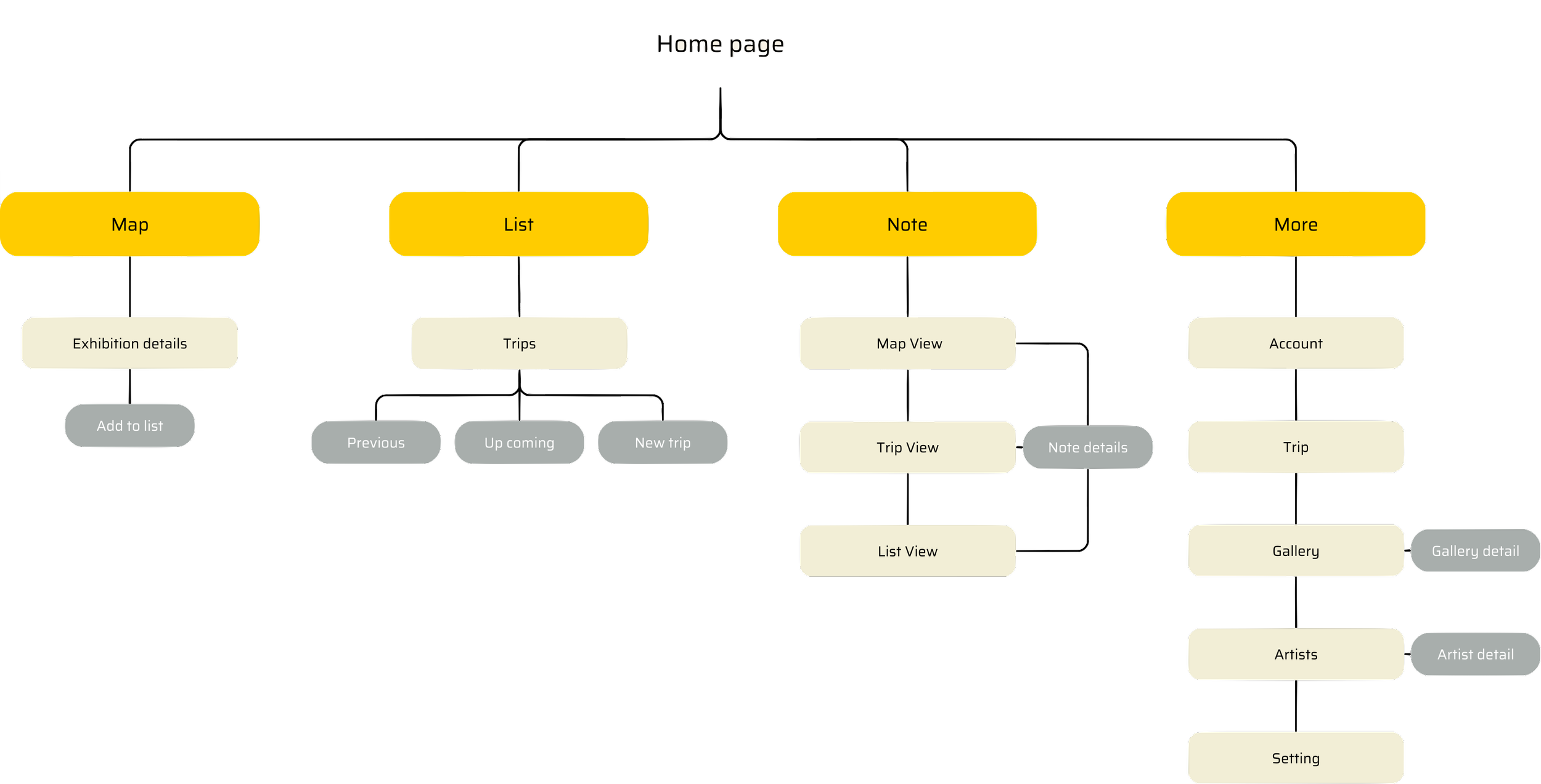
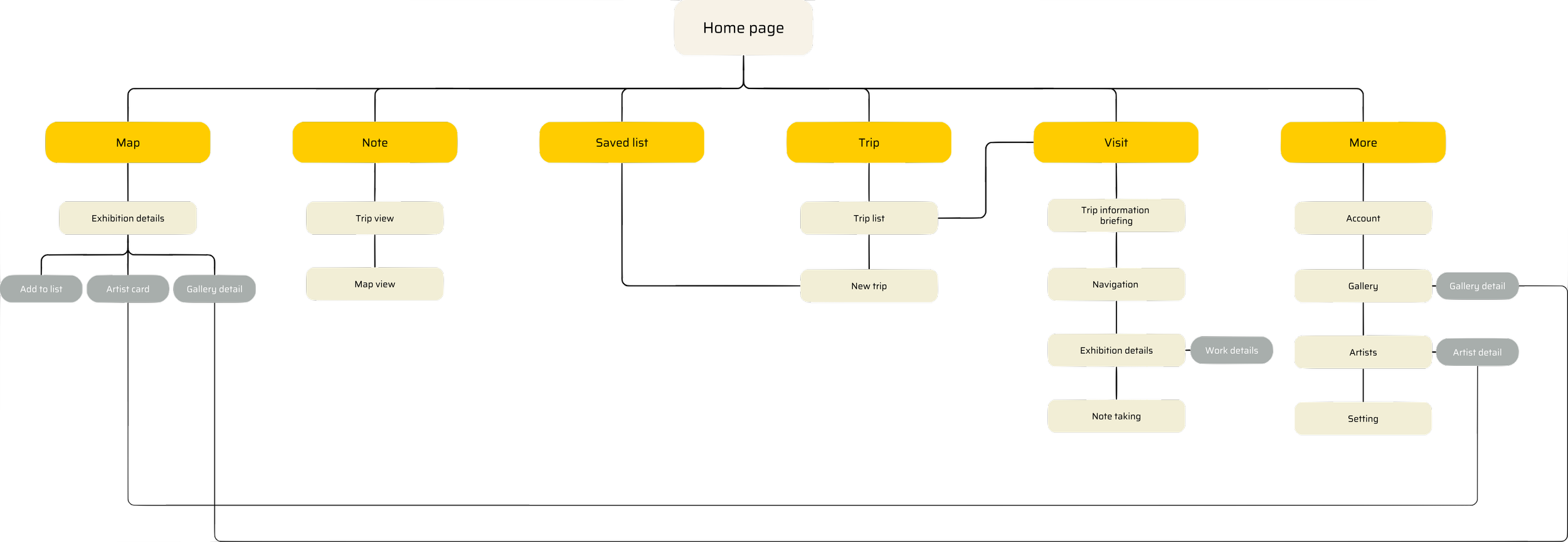
Information Architecture
Ideation
-
![]()
Exhibition detail & my list
-
![]()
Home page & Map
-
![]()
Map
-
![]()
Creating new trip
-
![]()
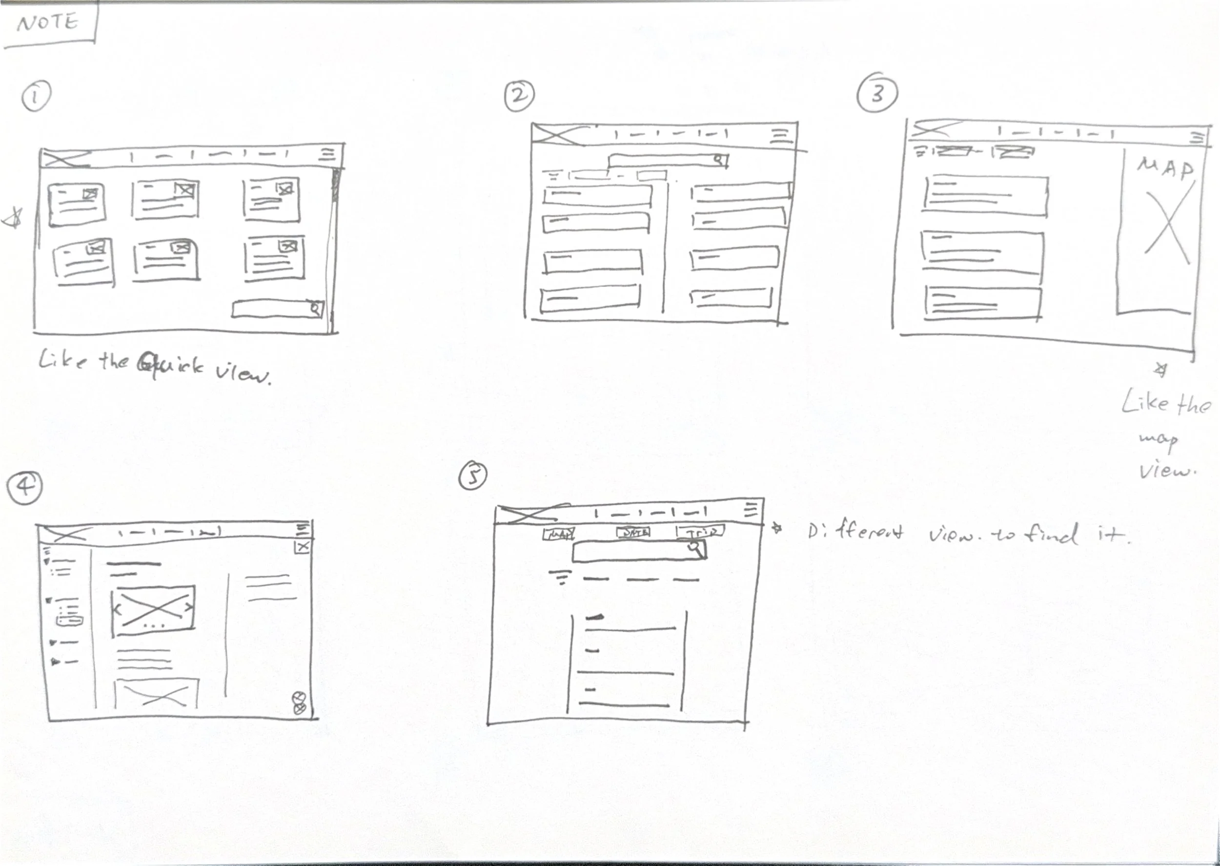
Ideation of note page
-
![]()
Ideation of trip page
-
![]()
Ideation of home page

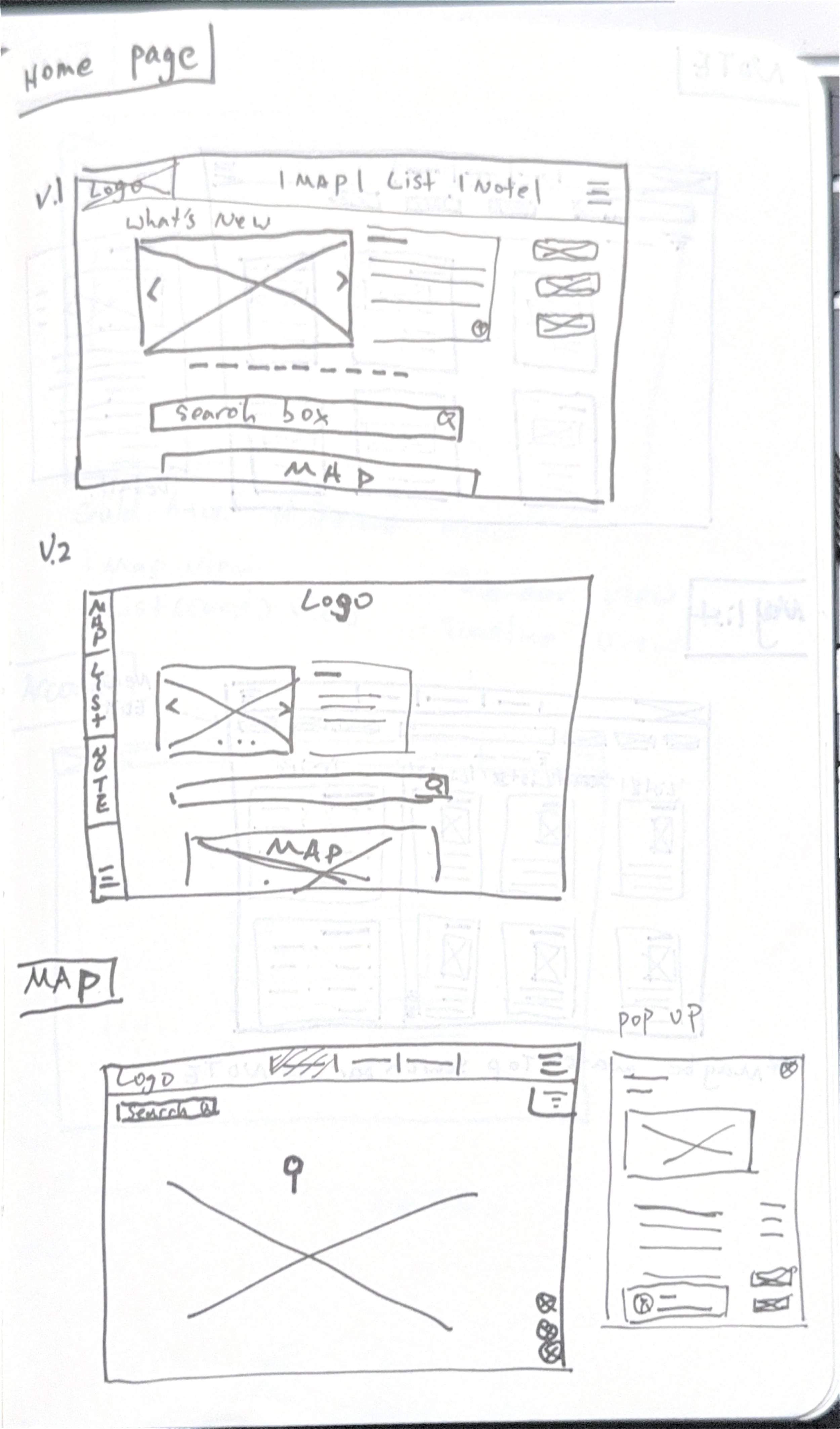


Wireframe
Home page

Menu

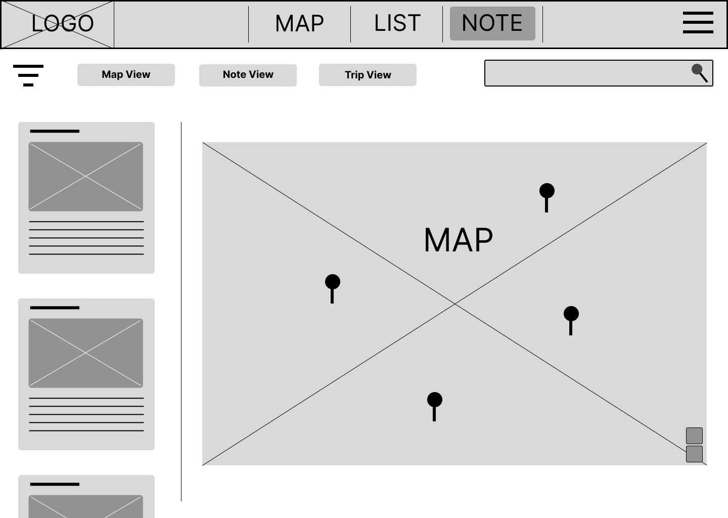
Map page

Exhibition detail
Saved list

Trip list

Planing new trip

Planing new trip

Planning
Confirmed new trip
Note list
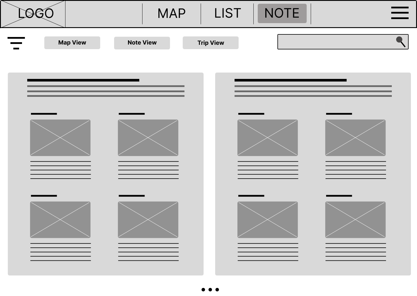
Note trip view
Note map view

User profile

Galleries
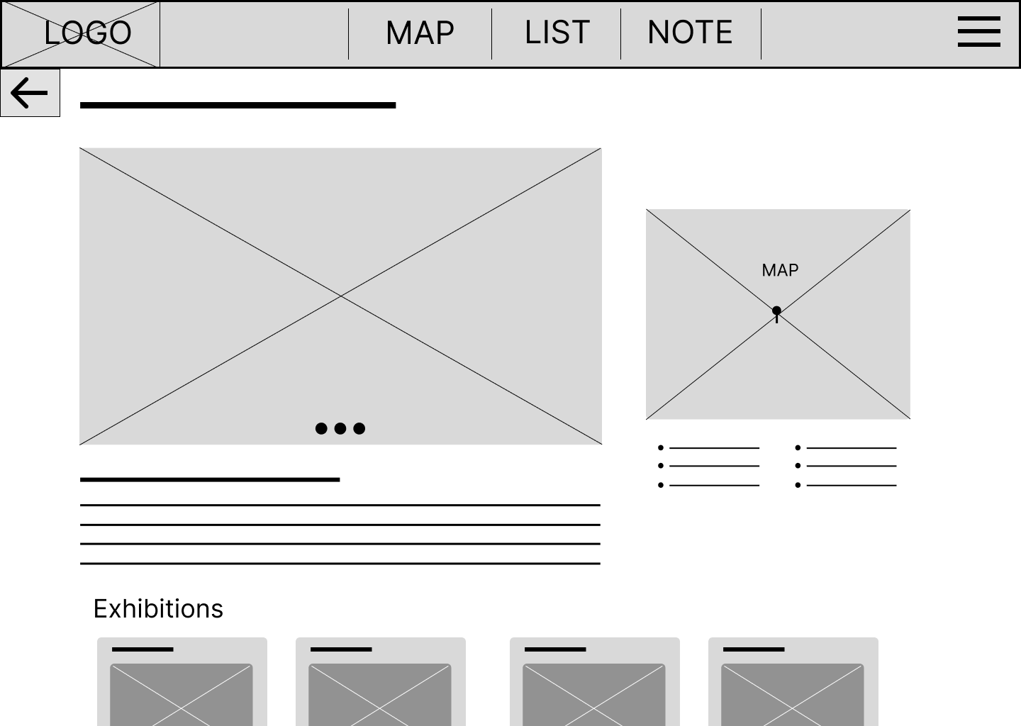
Gallery detail
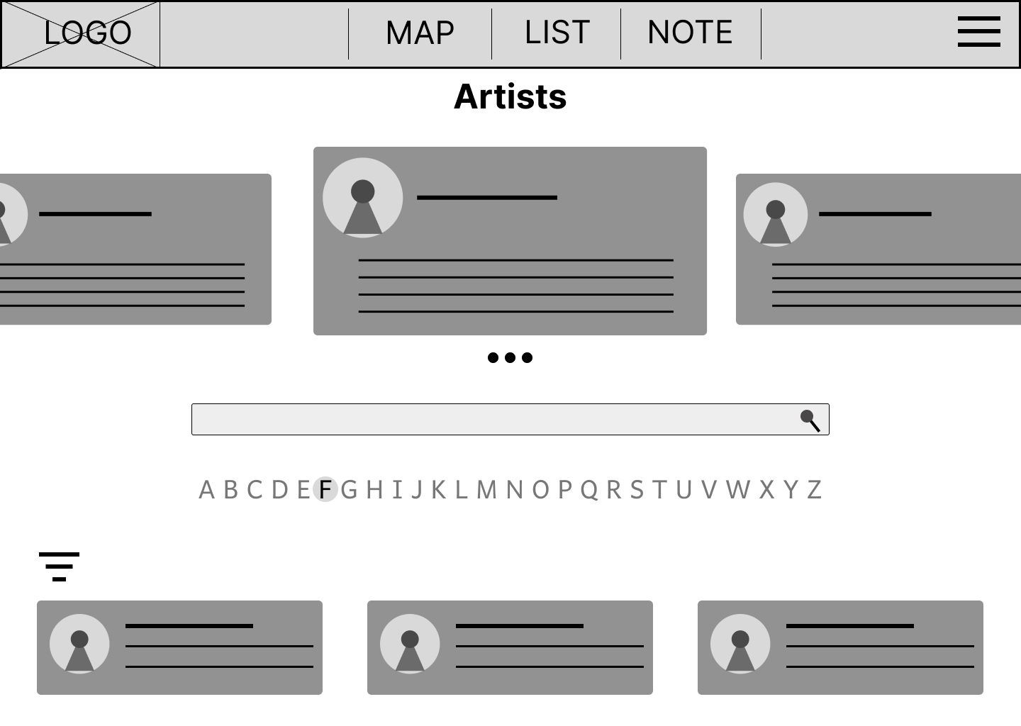
Artists

Artist detail
First testing
Plan:
Goal: Testing the main user flow of the website (1. Discover 2. Save 3. Plan), Prove of idea.
KPIs: Time on task, User error rate, usability scale
Methodology: Moderated study
Location: Online (Zoom)
Participants: 1 art tutor, 1 gallery worker, 1 curator, 3 art lovers
The initial usability study was planned and based on the wireframe. However, during testing, I discovered that the stripped-down nature of the design lacked essential information for users to comprehend. Consequently, the results may not have been as precise as desired. Nevertheless, the study yielded valuable insights into user flow and the diverse interactions users had with the interface.
Problem:
Participant didn’t fully understand the add exhibition page, which wasn’t clearly labelled. (Could be due to lack of information on cards.)
When being asked to discover a new exhibition, some participants clicked on the new trip option.
The exhibition details functioned well; some participants clicked on it before I asked them to.
We couldn’t test save functions due to limitations of Sigma; however, all participants showed an understanding of the function.
Users were asking how the time duration is decided.
The menu is a little confusing with the main topic in the middle and the sub-menu on the side.
The grey colour theme were not encouraging for further exploration
Insights:
The initial usability study was planned and based on the wireframe. However, during testing, I discovered that the stripped-down nature of the design lacked essential information for users to comprehend. Consequently, the results may not have been as precise as desired. Nevertheless, the study yielded valuable insights into user flow and the diverse interactions users had with the interface.
Function as intended, people found it useful.
A comprehensive tutorial elucidating the functions would significantly enhance user experience.
Providing actual content will facilitate users in grasping each function a effectively.
A simplified menu system would improve user navigation and efficiency.
Users anticipate the release of mobile app.
A more vibrant colour scheme will draw greater attention.
Mobile Information Architecture
Based on initial testing feedback, I’ve decided to start with mobile version for this stage of development. This ensures I can close the main user loop(discover, plan, navigate, note taking). Location-based services like exhibition details and note-taking will be the main focus.
Mobile prototype
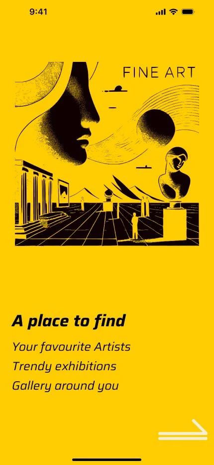
Intro screen to help user to understand what the app could do.
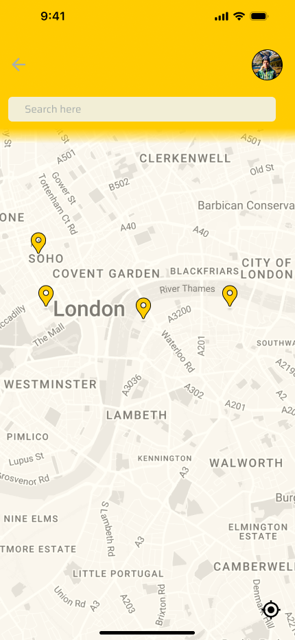
Sign in & Home Screen & Menu


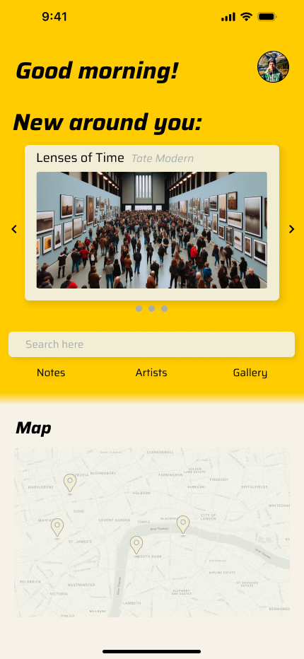


Discover and save & Checking previous note


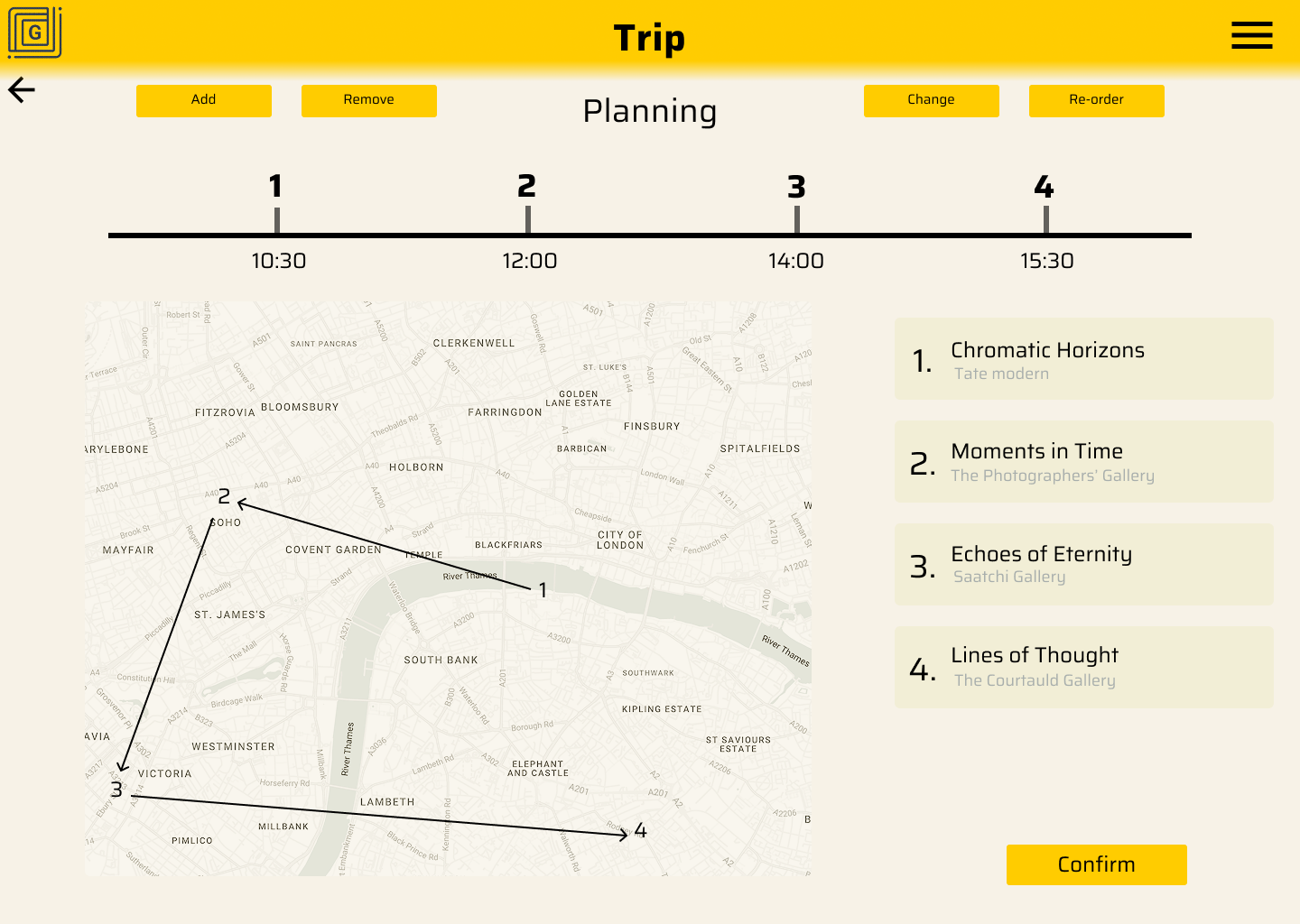
Creating, view and edit trip


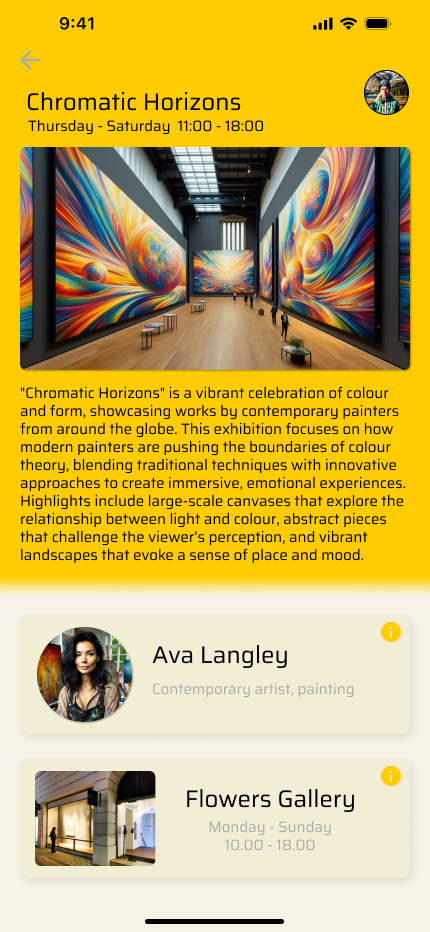
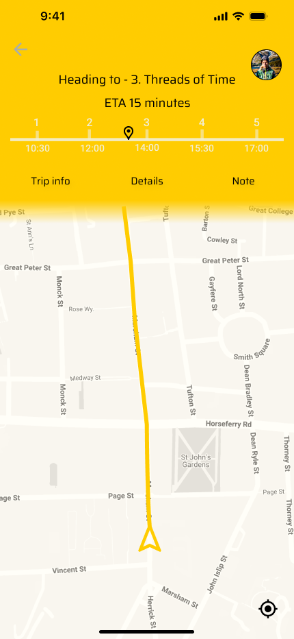
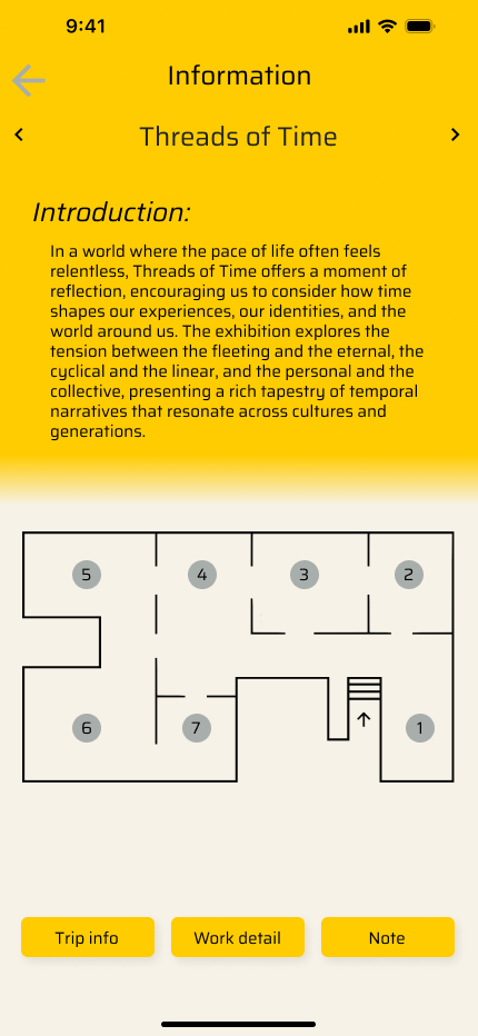
Trip over view, Navigation, Exhibition details, and Note taking


Profile, Artists and Galleries


Desktop prototype
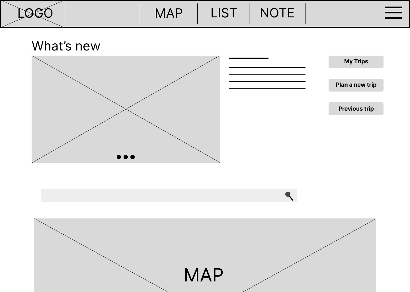
Home page, Map, Profile


Desktop prototype
Home page, Map, Profile


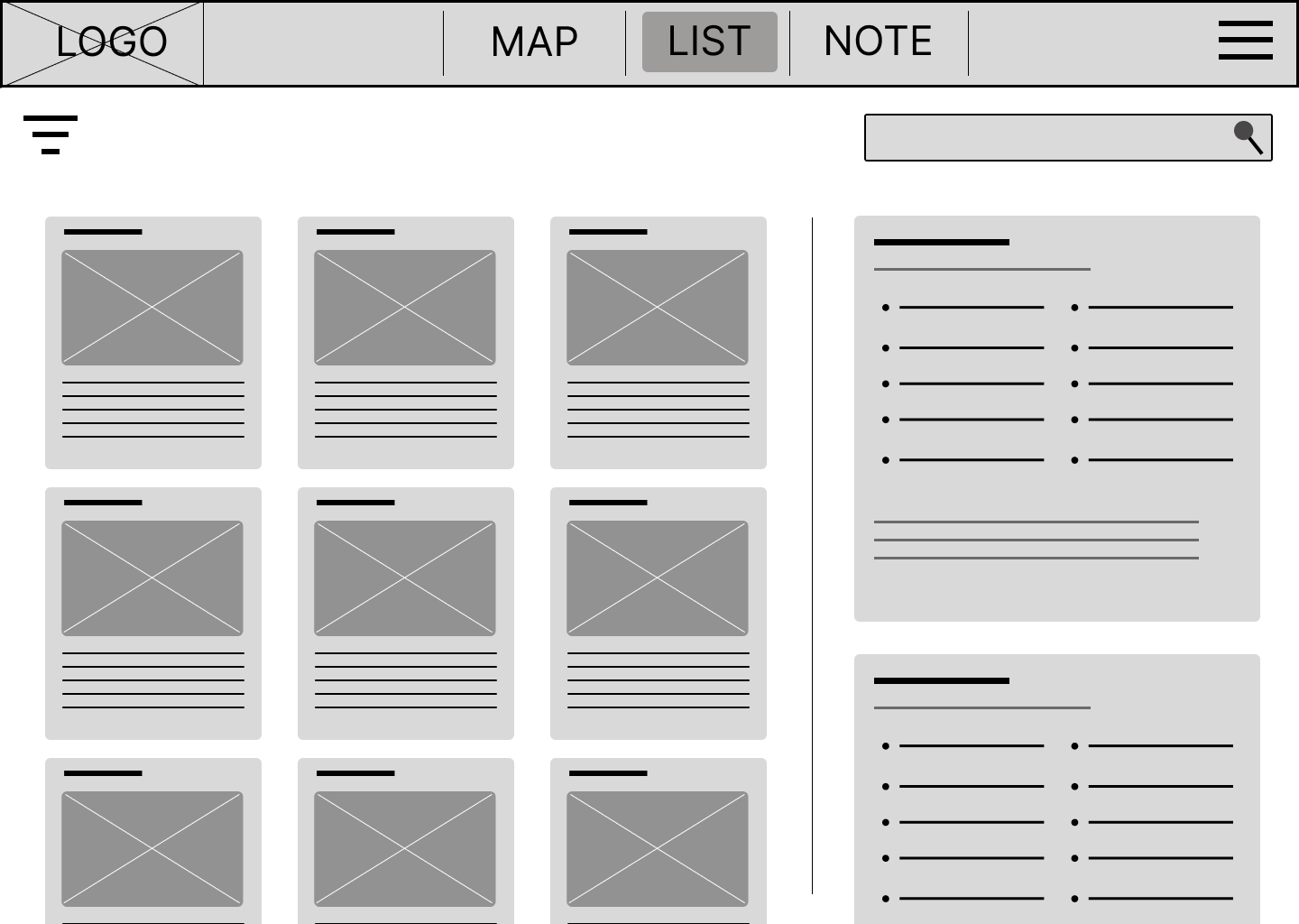
Saved list, Trips planning and editing

Saved exhibitions

Trip over view

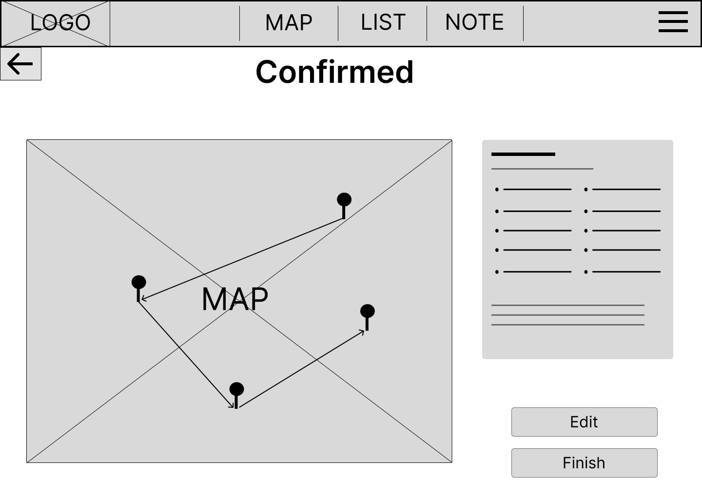
New trip step 1

Edit existing trip

Step 2
Step

Finish
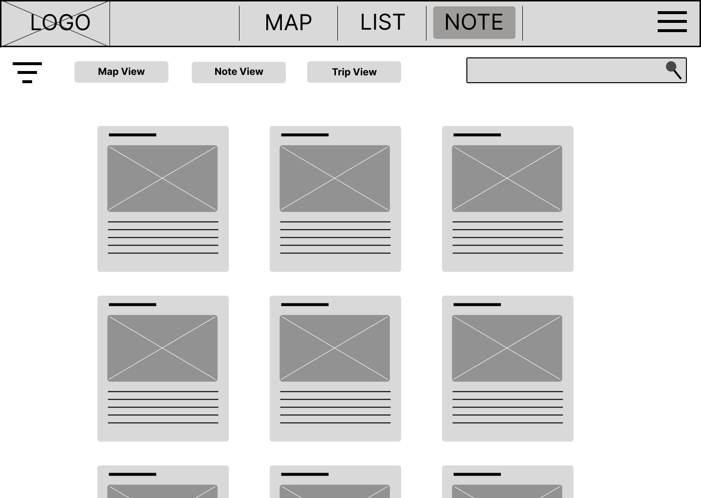
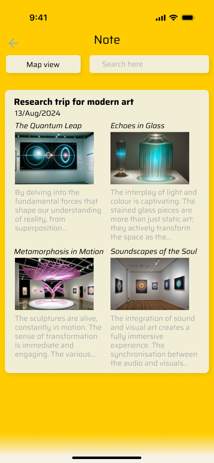
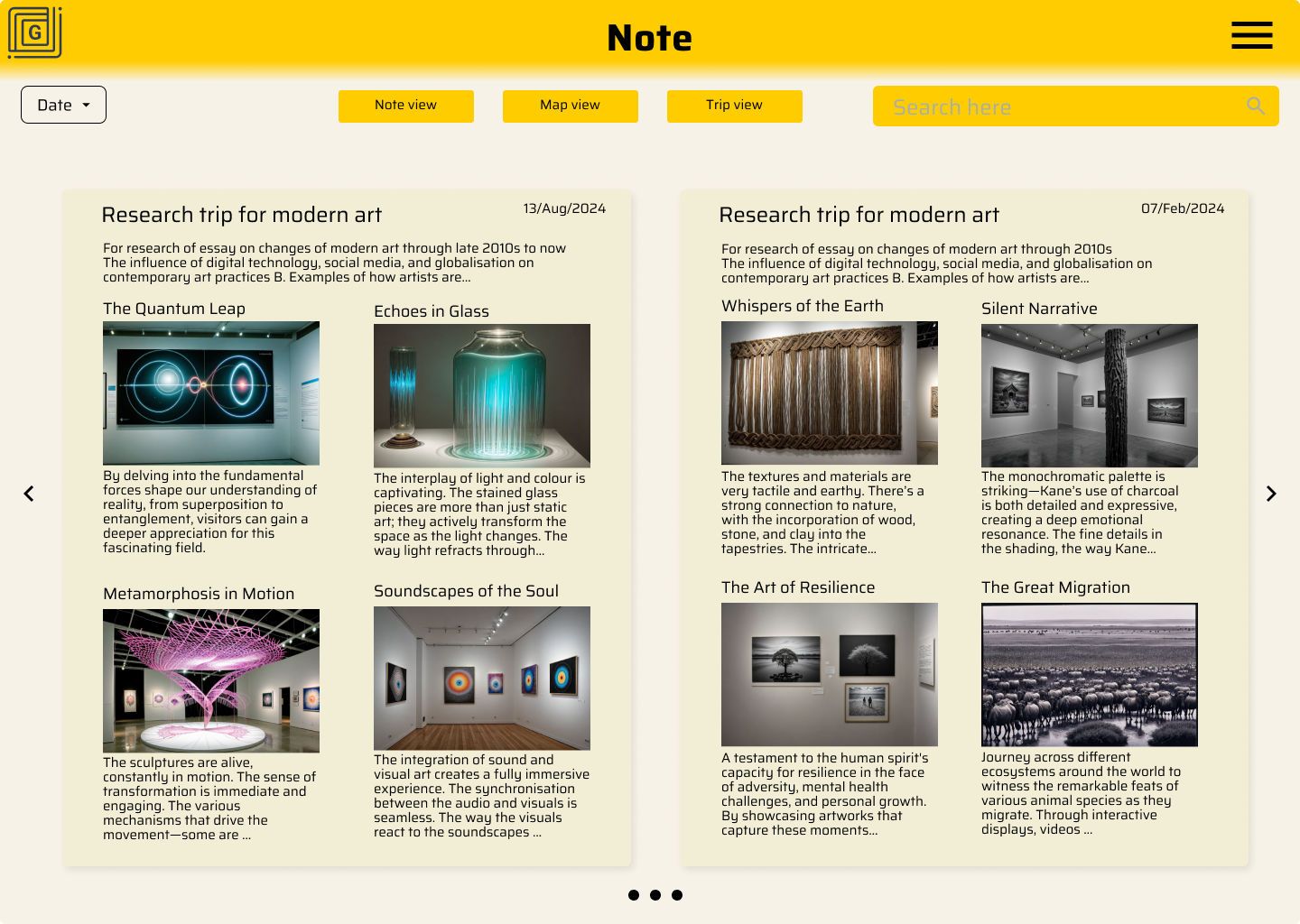
Notes
With 3 different ways of viewing to help user find what they need quickly


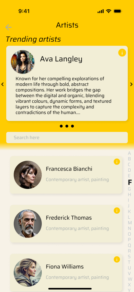
Artists & Galleries


