Gmail UX study
2nd - 7th December
Table of contents
Creative process
Research & Insights
Ideation & Sketch
Prototype in Figma
Conclusion
Project background
Email has been a key part of communication. As one of the most widely used email apps in the world, Gmail has greatly helped many with both work and life.
Given its large user base, the app needs to cater to a wide range of users. However, it lacks certain features and functions that could benefit many users.
This presents an opportunity to enhance what Gmail offers, based on user feedback.
*I’m not affiliated with Google in any capacity, and this case study’s views are strictly my own.
Creative process
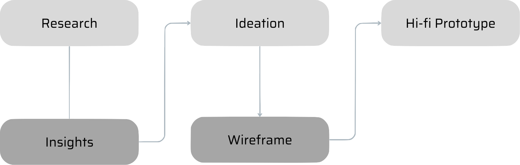
Research
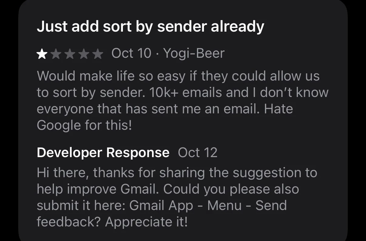
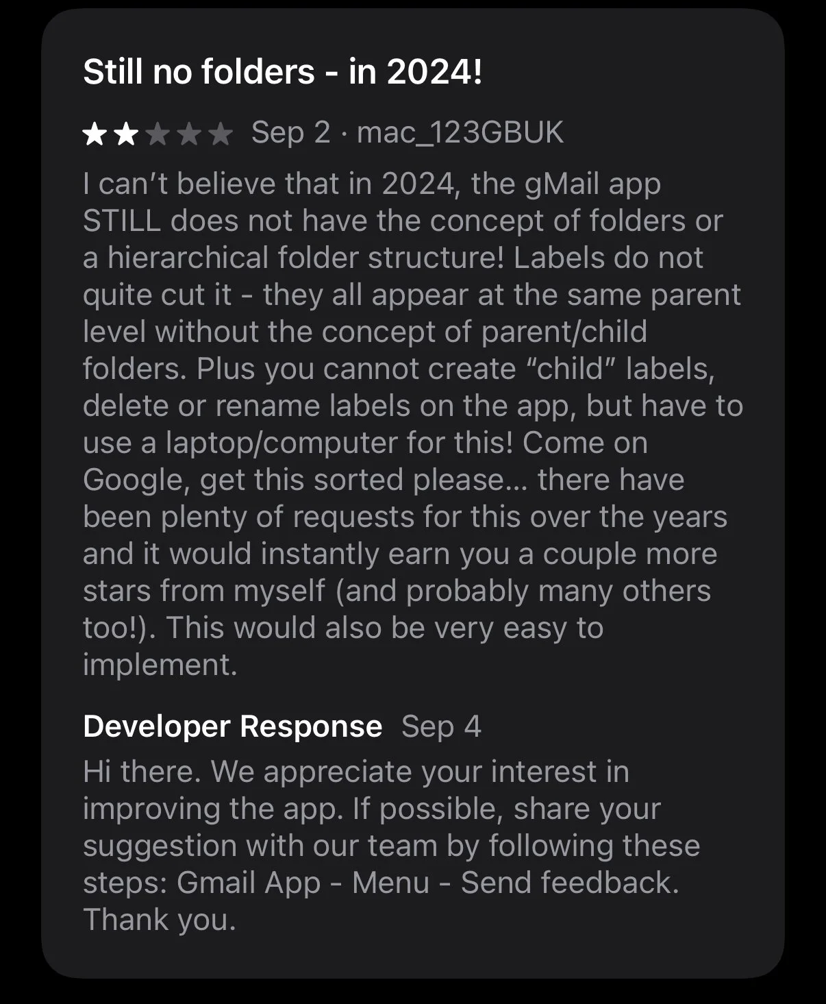
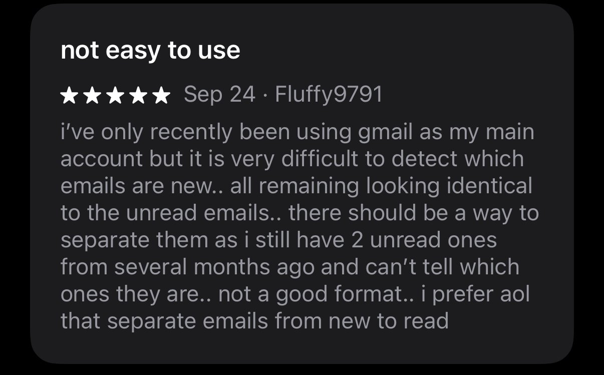
Research based on app store reviews of the Gmail app, with insights gathered from some of the most common issues reported.
Insights
1. Users desire diverse email sorting options.
2. Inability to create folders and organise emails in a personalised manner.
3. Distinguishing between read and unread emails is challenging.
4. There is a lack of functionality to separate work and personal accounts.


Ideation & Sketch
To give the maximum flexibility to users, I decided to build different views instead of using filter system. Users could switch and customise views based on their needs.

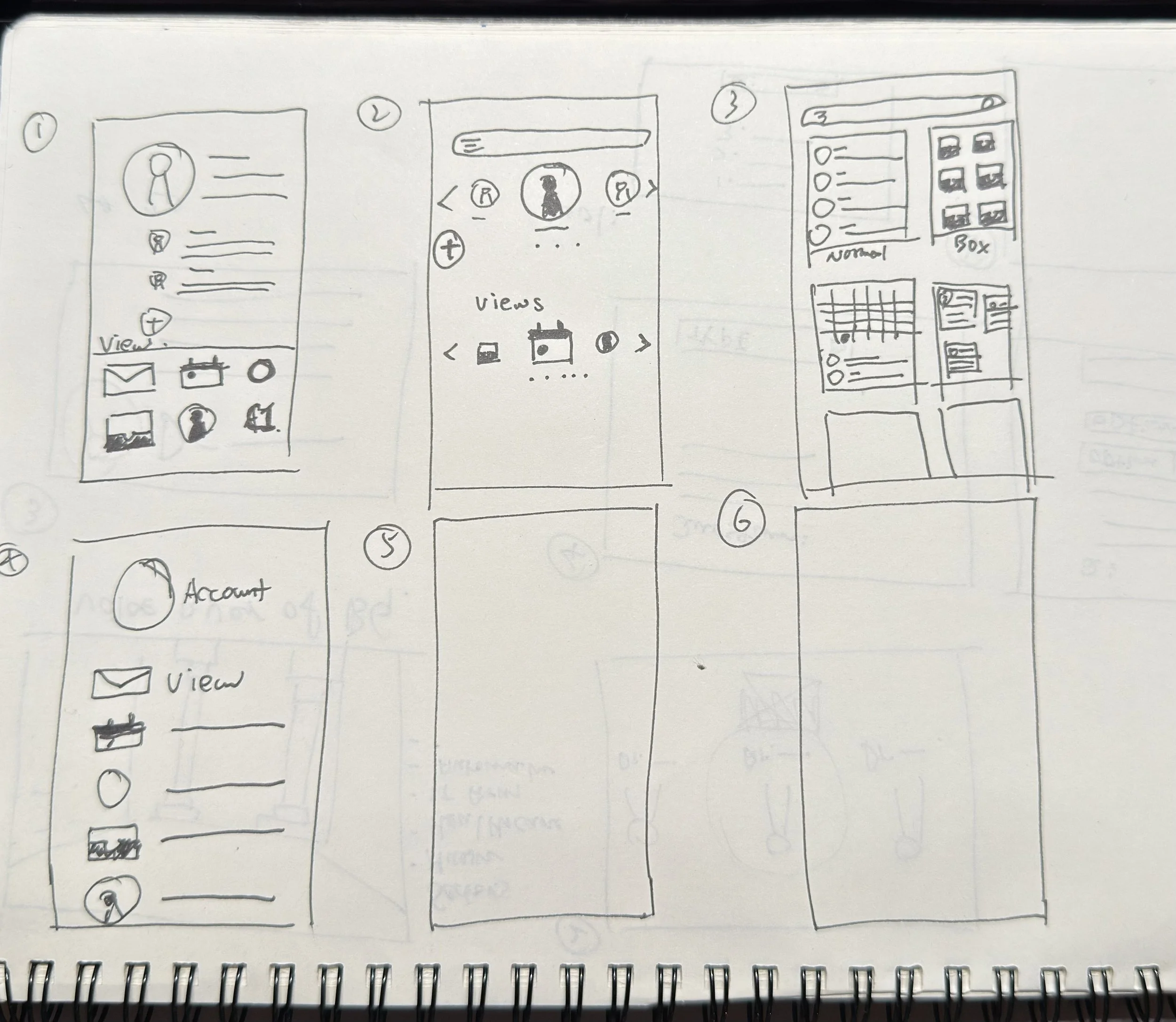
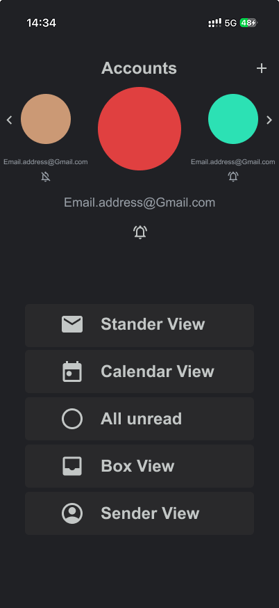
Another focus was designing a new page for switching accounts, which gives users the ability to mute notifications and choose different views.
Prototype on Figma
Easy to switch and mute accounts when needed
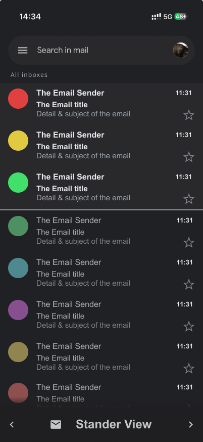
Greater difference between read and unread
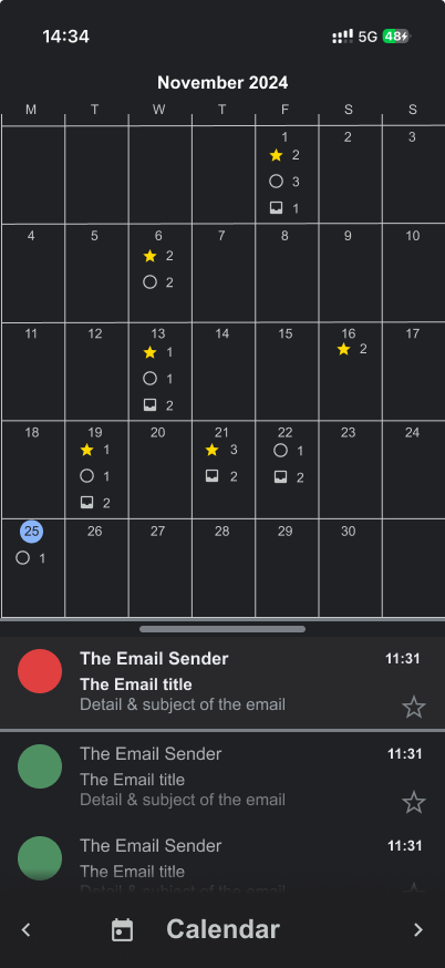
Inspired by google calendar to keep it unified.

Sender view was requested by users.

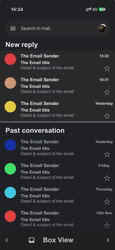
Redesigned conversations page with greater different between reply and send emails.
Prototype on Figma
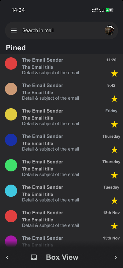
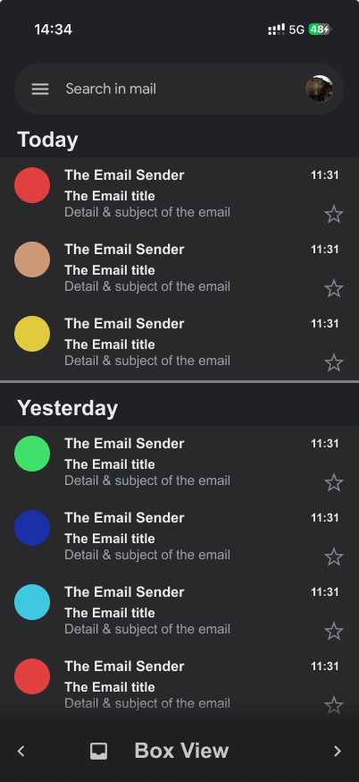
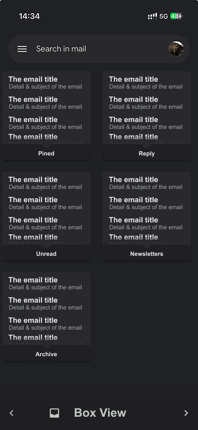
Box view allows more customisable ways to organise emails. User could also create their own customise box using filter system.
Box view over view

Conclusion
As quick practice of UI design, I really enjoyed building based on google’s existent design foundation. Made me realised the importance of a good design system & guideline.
However, I realised some of the limitations. To ensure consistency with the rest of the app, there were certain constraints I had to work within.